Rico New Mobile App
We joined the company during its digital transformation, where the broker’s mobile application had been neglected in both user experience and engineering. Our mission was to give it a complete overhaul, starting from scratch with a blank slate.
At the beginning of the project, we were just two designers. As the project gained traction, we expanded the team to include engineers, a PM, and content specialists. Throughout the process, we worked on business analysis, information architecture, usability testing, micro-interactions, launch strategy, and post-launch refinements.
In this project, I collaborated with another designer and, alongside the PM and engineers, we built the entire experience from the ground up.
Problems & Goals
Challenges: The app was poorly rated by customers, with store ratings of 2.8 on Google and 1.6 on Apple.
Goals: Improve key business metrics, including app visits, in-app transactions, NPS, and store ratings.
Results
We successfully improved all key indicators: app visits, transactions, and Assets Under Management (AUM). The app's ratings soared from 2.8 (Google) and 1.6 (Apple) to 4.5 across both platforms. The project was universally recognized as a success.
Methodology
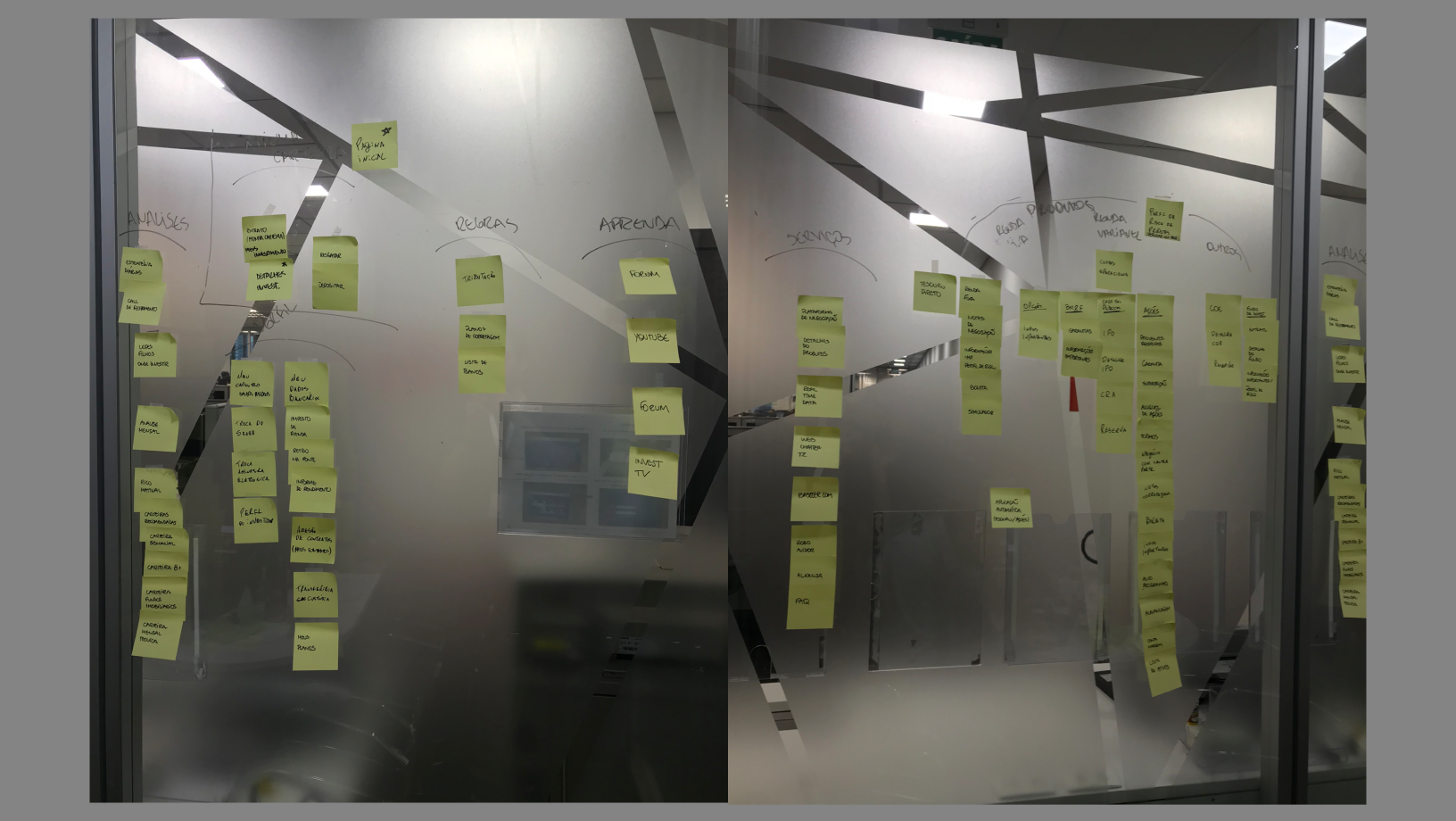
1. Content Inventory & Heuristic Analysis
As a starting point, we conducted a comprehensive mapping of all content and actions within Rico's website and app. This allowed us to gather a clear overview of all existing elements and begin reorganizing them effectively.
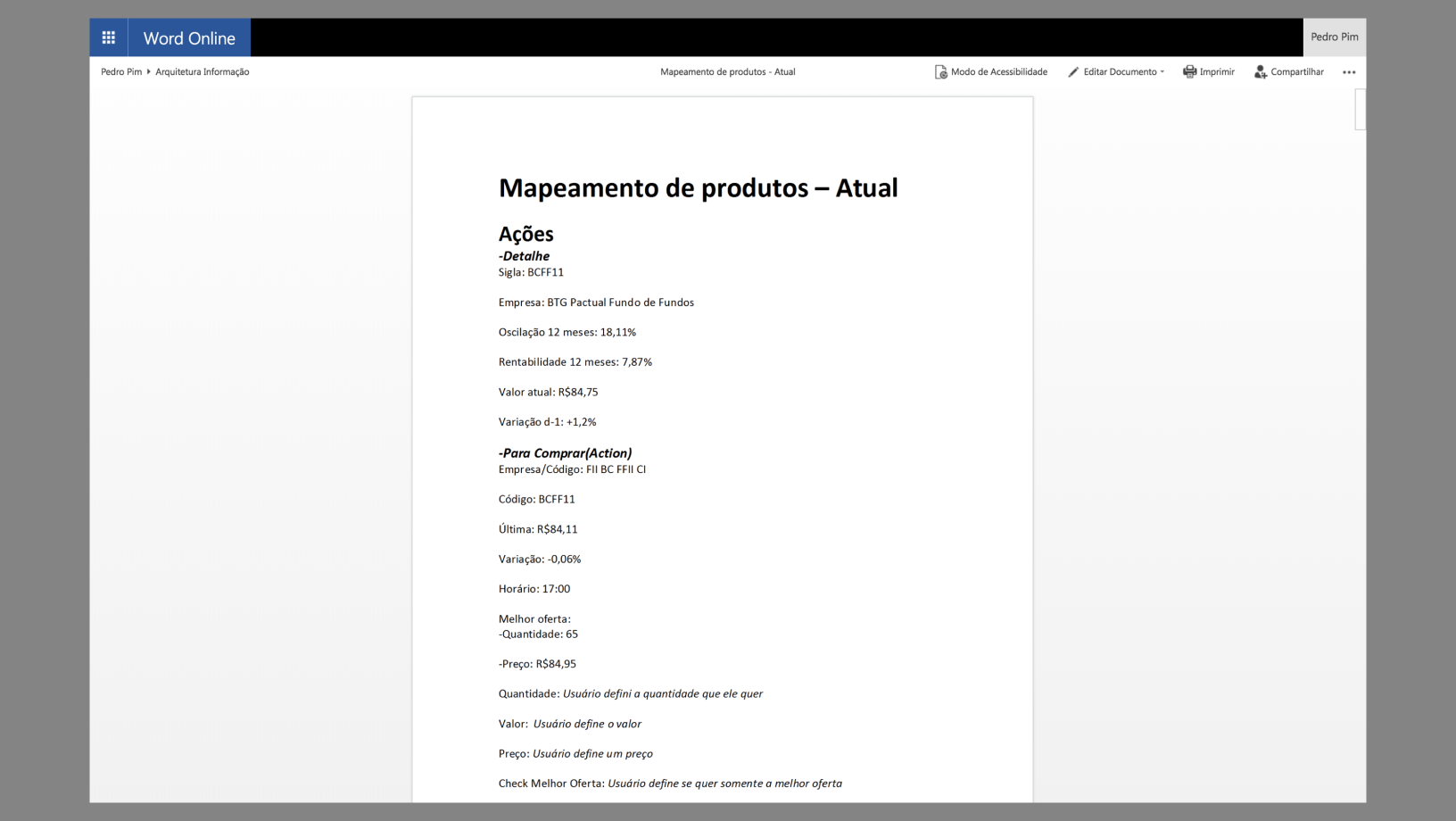
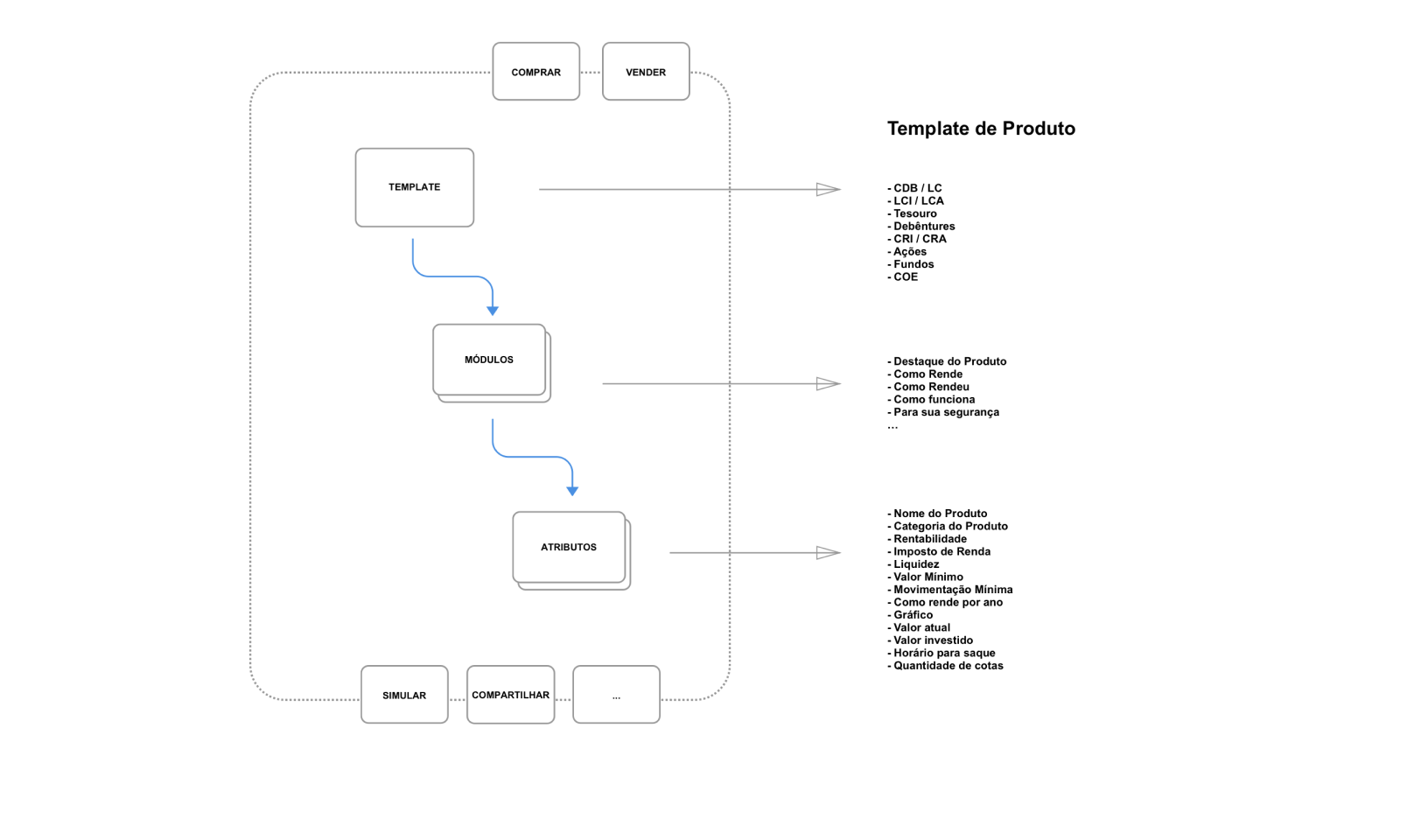
Additionally, we structured the metadata for all financial products. This foundational step enabled us to rethink the information architecture in a way that differentiated us from our competitors and aligned with user needs.
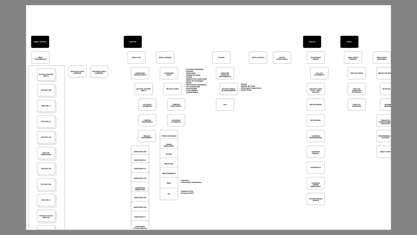
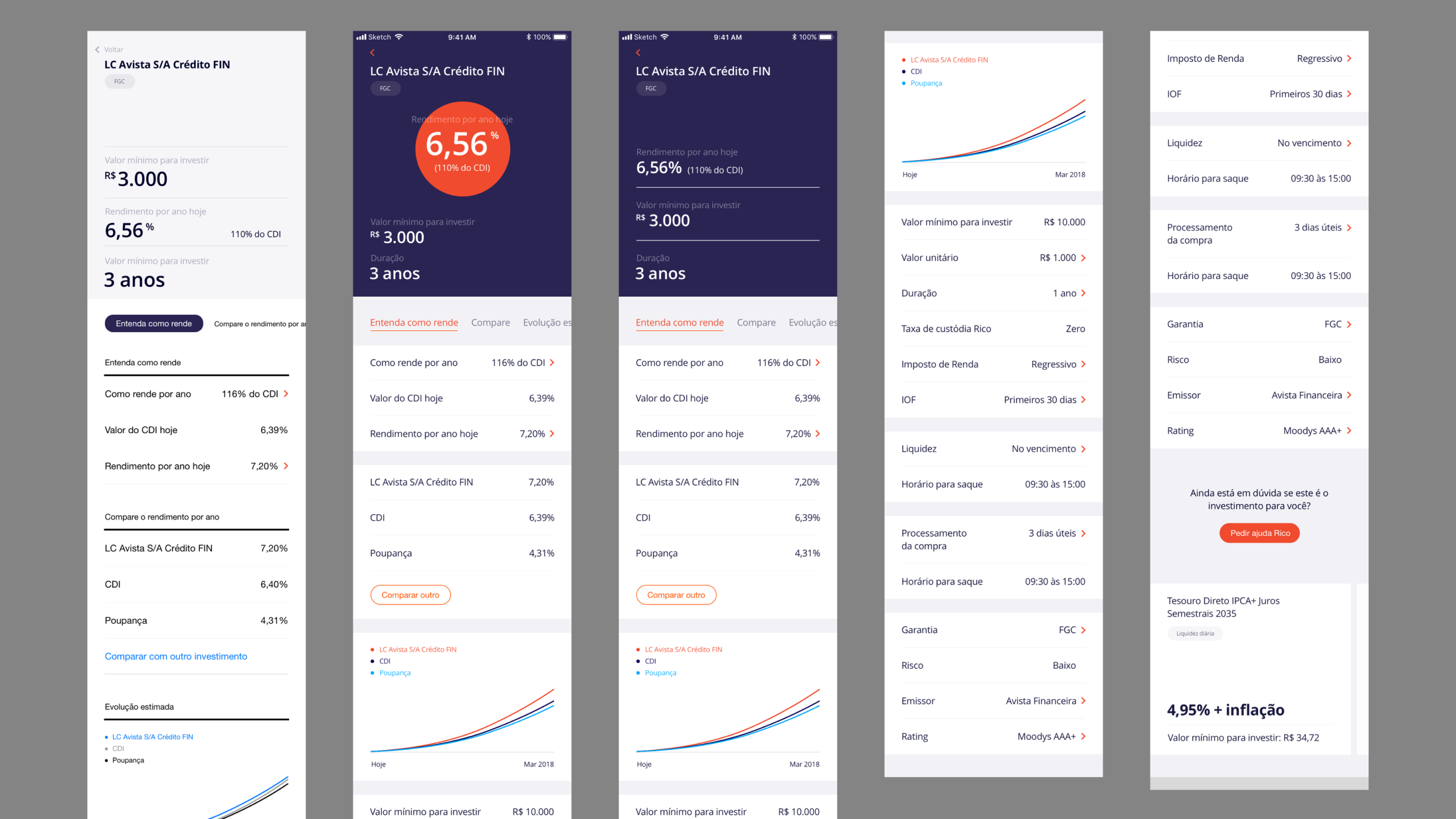
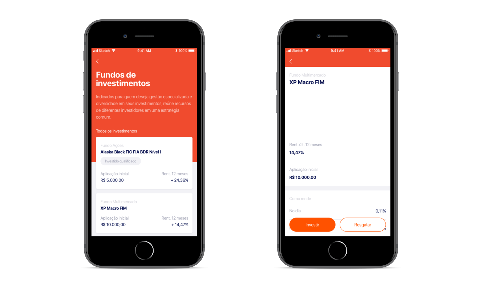
2.Information Architecture
Building on the content mapping, we began modeling and simplifying Rico’s architecture. Over time, the platform had evolved into a patchwork of content and features. To address this, we established an architectural pattern based on "layers" and "facets," creating a more intuitive and scalable structure.
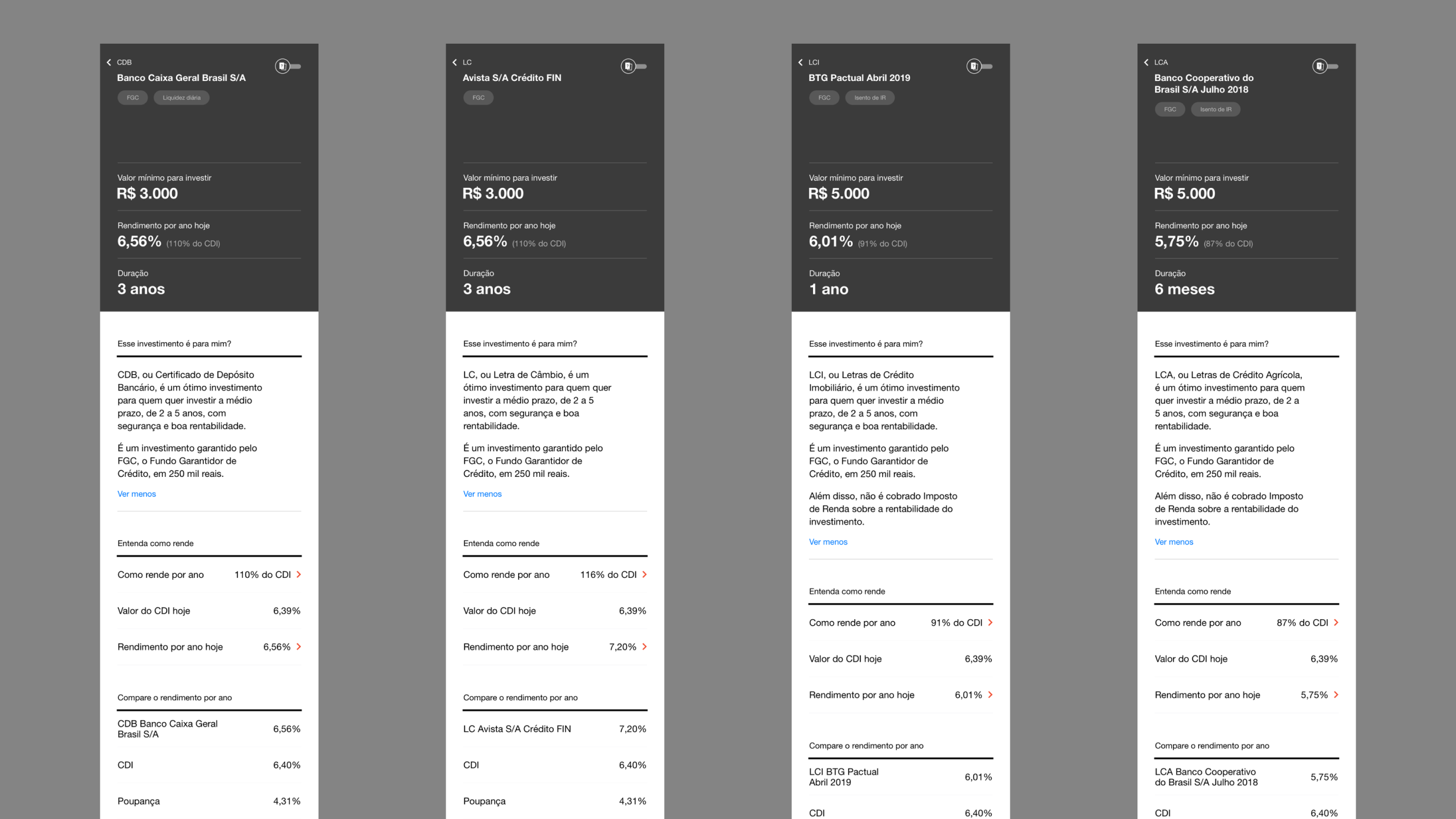
Simultaneously, we standardized metadata and introduced consistent categories across all types of investments, including stocks, fixed income, and funds. This ensured a uniform presentation of content across products, making it easier for users to explore and learn about unfamiliar investment options. This consistency improved usability and fostered greater confidence in navigating the platform.
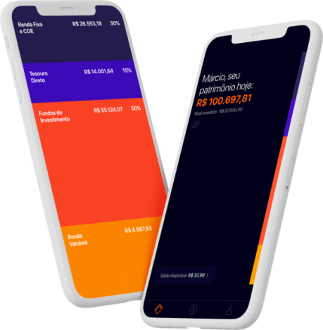
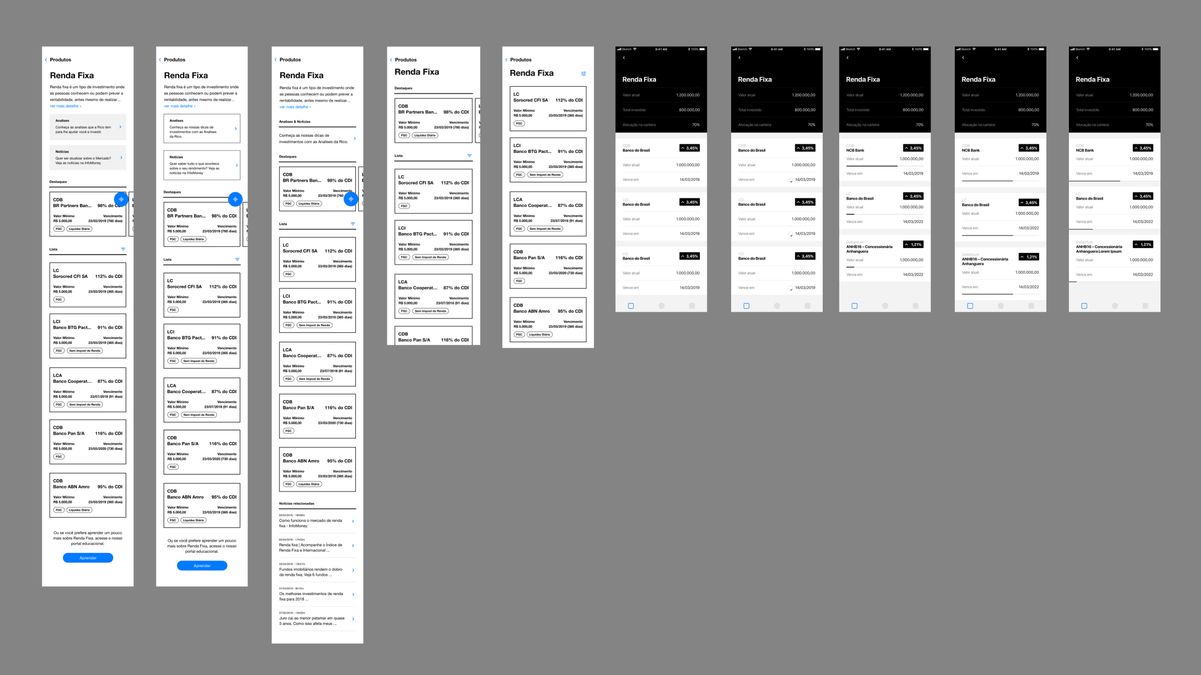
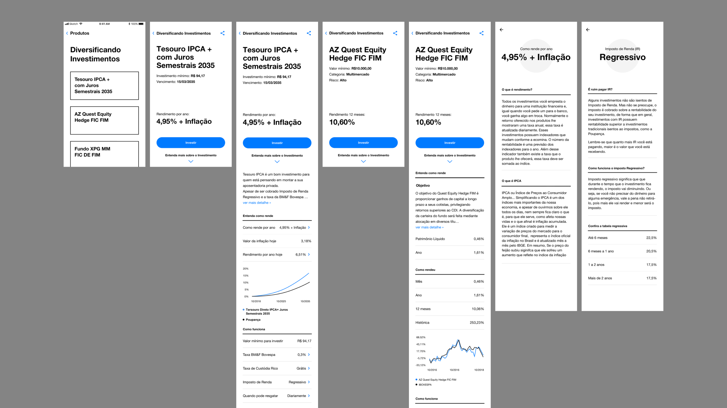
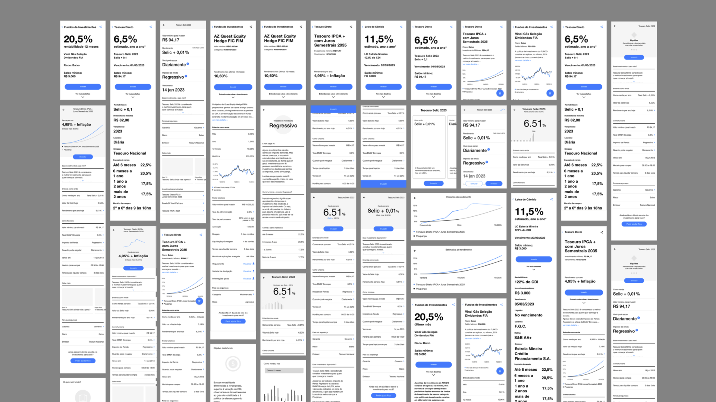
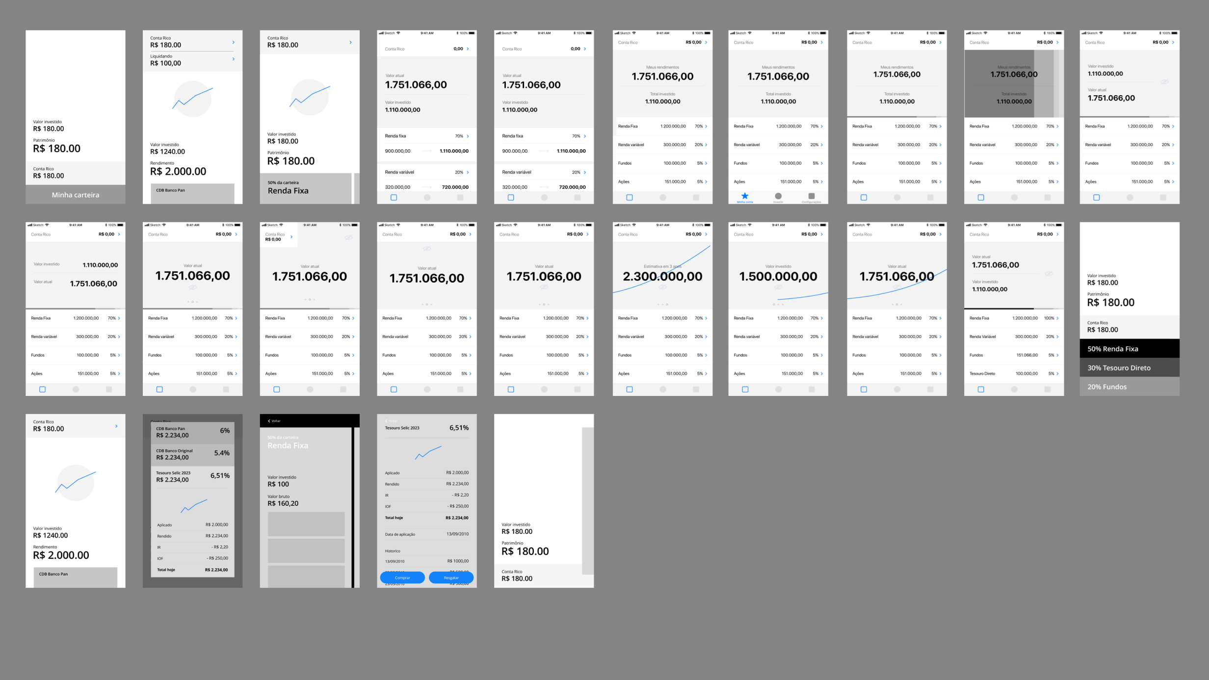
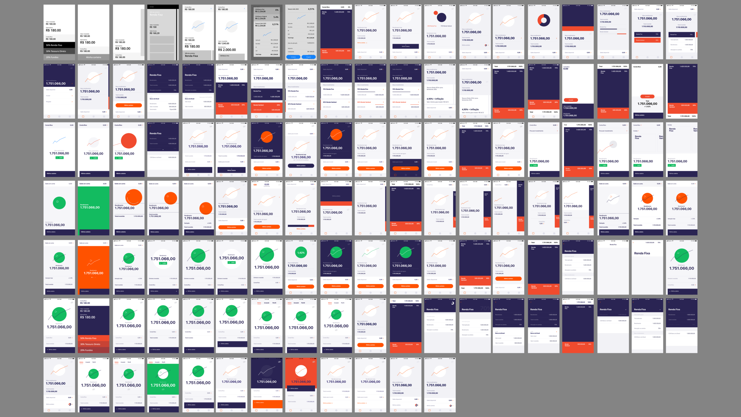
3. Wireframes, Visual Design, and Prototyping
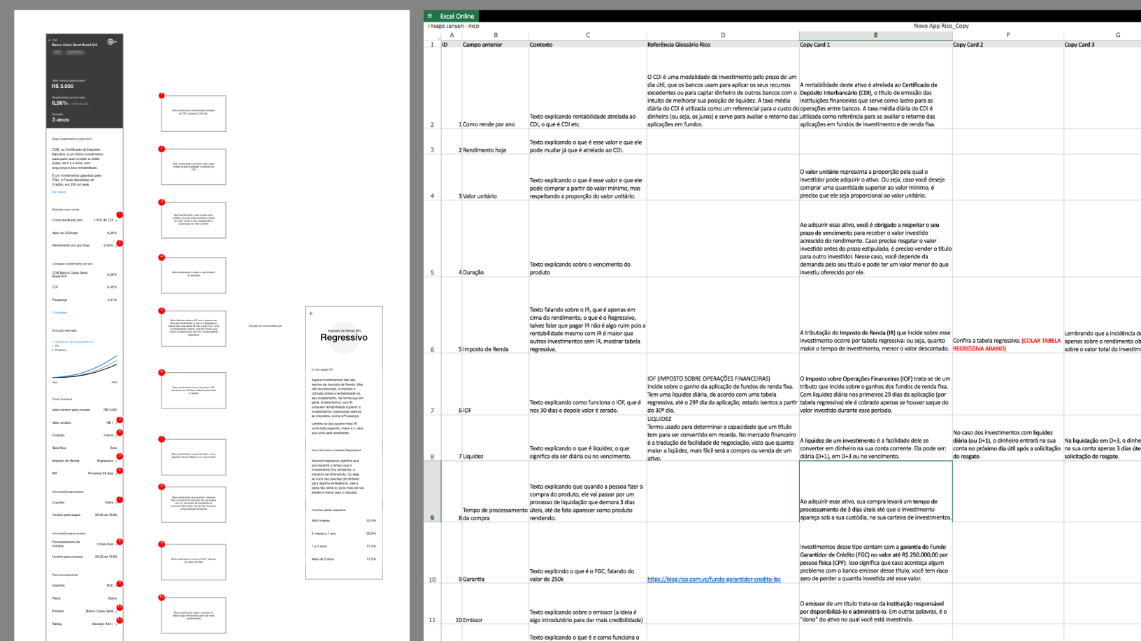
Following the initial modeling phase, we delved deeper into the "layers" we had created and began designing their interfaces. We chose to start with the product pages, as these would provide key insights to guide the development of higher-level layers like aggregators and the home/dashboard pages.
In the early stages, we prioritized brainstorming and problem-solving, unconstrained by technical or business limitations. These initial designs were presented in collaborative meetings with business teams from each product area (e.g., Fixed Income, Funds, COE) and the technology team. Feedback from these sessions helped refine our approach, allowing us to iteratively adjust the designs to align with emerging constraints.
Ideas that couldn’t be implemented immediately due to constraints were added to a backlog for future development, ensuring that no valuable insights or innovations were lost.
4. Final Refinements
Throughout the design process, we conducted usability tests to gather feedback directly from users. These insights allowed us to refine interactions and address pain points, ensuring the design met user needs effectively.
With iterative improvements based on user feedback, we honed the product until we reached a point of confidence in defining the MVP, balancing functionality and user experience for a successful launch.
5. Release Strategy: Beta Testing
Launching a product built from scratch—both in design and technology—required a cautious release strategy. We started with a select group of beta testers, aiming to collect valuable feedback before a broader rollout.
The feedback from beta users was overwhelmingly positive, providing the confidence needed to scale the launch to the entire user base.
6. Conclusion
his was an exhaustive yet rewarding project that involved building a team, creating a product from the ground up, testing and refining it, aligning with various product areas, and iterating post-launch. Despite the challenges, seeing the positive impact it had on customers made the effort incredibly worthwhile.